Looks like DC Comics is getting a makeover. This press release was sent out regarding the new logo design for DC Comics:
DC Entertainment, a Warner Bros. Entertainment company and home to iconic brands DC Comics, Vertigo and MAD, revealed today a new brand identity. The new identity is reflective of the company’s mission to fully realize the value of a rich portfolio of brands, stories and characters, distinguished by incredible breadth and depth across publishing, media and merchandise. A new logo for DC Comics was also introduced, closely aligning with DC Entertainment’s new mark.
Click the headline or the link below to read more about DC’s new Logo and to see a ton of images showing it off.
The news of the new logo certainly comes as a surprise to DC Comics fans. Personally, I don’t like it. It looks like the logo to an operating system start up logo or something. And to non hardcore DC fans, it may be tough to decipher upon first glance. I personally think the last logo they had was perfect.
What do you guys think? Do you love it or hate it (I have a feeling what the majority of people will think)? Let me know in the comments!


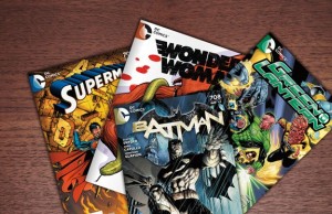
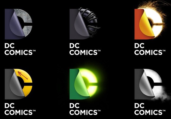
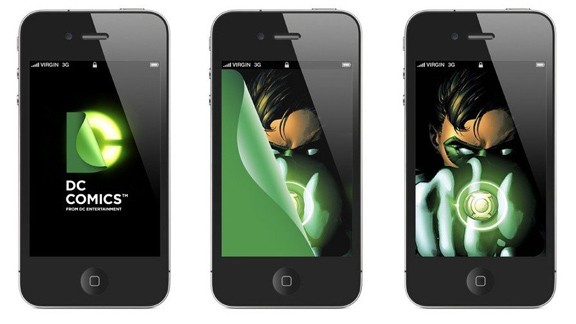
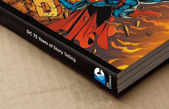

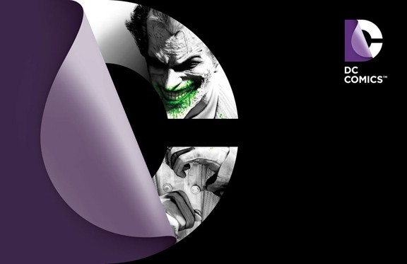
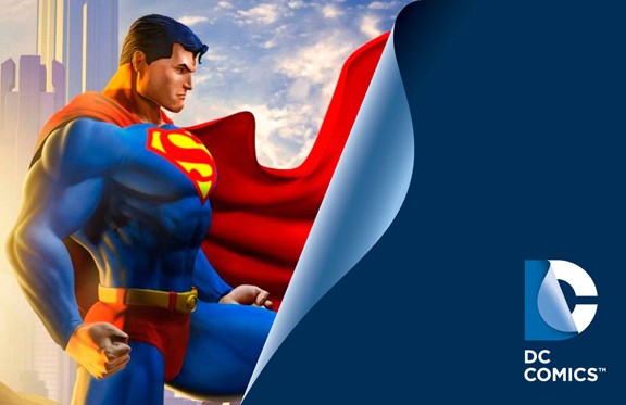
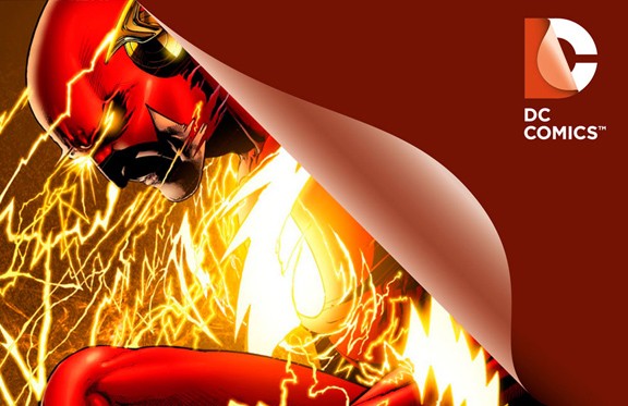
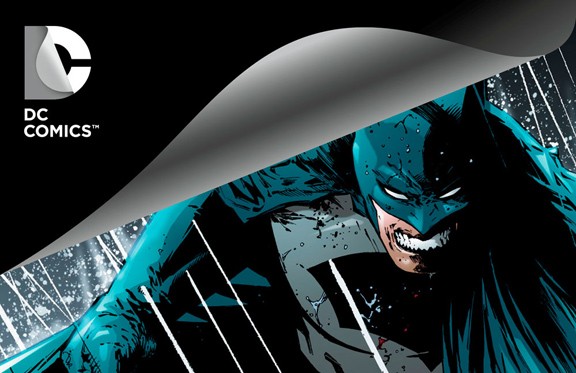

Yeah, I don’t understand why they would go with this logo?
I like the idea of what they’re going for matching colours and graphics for different characters but I feel the new logo is to bland. Why change something that is internationally recognized and loved?
Beyond bad. Who was the genius who signed off on this? It’s hard to recognize, changes color, and is not readily interpreted as DC Comics. Horrible Brand decision. They already turned everything upside down. I guess if your going to screw something, might as well go all the way, right?
First they ruin their stories by changing the continuity yet again and now they change the Logo. The Logo is ugly and uninspiring. I guess this is the reason some of their issues prices will be going up. They paid someone to come up up with that piece of garbage! They should have kept the DC part seperate and not merge it. I bet Marvel is having a great laugh at this!
I think that the old logo was very American, in that it very easily identified the name DC (which us foreign types identify as the US capital) and the star (which we foreign types identify as an american symbol). I can see that if they are wanting to reinvent the logo they would maybe want to make something that doesn’t come across as too country specific to grow the international market.
Saying that, I’m not a fan of the new logo. It looks quite unimaginative and for a company that wants to promote its adoption of digital delivery, the incorporation of the image of paper turning just seems anti-intuitive.
I can see why they’d want to vary their logo and brand each of their ‘divisions’ or ‘universes’ as it were, but it looks like someone has just got the art department intern to experiment with skinning the logo in Photoshop.
I think I understand all the reasons behind the move to a new logo and having multiple versions, but I don’t think the results are entirely, or even remotely, successful.
The old logo certainly invoked America with the star and the letters DC. However, DC stands for “Detective Comics” which back in the 40’s was its most successful comic book. But it would be very easy for someone to see it and think it stands for America’s capital city. Especially with the star.